ROInets 3 - Group network connectivity analysis
This example uses shows how to analyze static connectivity at the group level.
Contents
TUTORIAL
Here we will perform a standard connectivity analysis using ROInets. Core functionality is provided by ROInets.run_network_analysis(). The key inputs are
- A set of beamformed SPM MEEG objects
- A spatial basis matrix - a matrix mapping voxels to parcels
The analysis can be time consuming, and pre-generated results are included with the OSL example data (not available through GitHub). To re-run the analysis (~15-30 minutes), set run_analysis to true below
run_analysis = false;
Either way, we will now walk through how to set up the analysis and then visualize the results. First, we select the spatial basis we want to use
spatial_basis_file = osldir('parcellations','fmri_d100_parcellation_with_PCC_reduced_2mm_ss5mm_ds8mm.nii.gz');
To run the analysis, we need a list of MEEG objects. Below, we identify where the data are, and where the output should be saved to.
data_dir = osldir('example_data','roinets_example');
output_directory = osldir('practical','roinets_demo');
if run_analysis
    mkdir(output_directory)
end
Next, we load the MEEG files. Typically, the source-space signals are stored as an online montage. It is essential that this montage is the selected montage. Therefore, we need to make sure at this point that the montage is switched to the correct one.
if run_analysis
    subjects = 1:10;
    D_files = {};
    session_name = {};
    for j = 1:length(subjects)
        session_name{j} = sprintf('subject_%d',subjects(j));
        D = spm_eeg_load(fullfile(data_dir,session_name{j}));
        D_files{j} = D.copy(fullfile(output_directory,session_name{j}));
        D_files{j} = D_files{j}.montage('switch',2);
    end
end
The settings for ROInets.run_network_analysis() are passed in as a struct. See run_network_analysis.m for a full listing of available options
if run_analysis
Settings = struct();
Settings.spatialBasisSet          = spatial_basis_file     % a binary file which holds the voxel allocation for each ROI - voxels x ROIs
Settings.gridStep                 = 8; % mm                % resolution of source recon and nifti parcellation file
Settings.Regularize.do            = true;                  % use regularization on partial correlation matrices using the graphical lasso.
Settings.Regularize.path          = logspace(-9,2,80);     % This specifies a single, or vector, of possible rho-parameters controlling the strength of regularization.
Settings.Regularize.method        = 'Friedman';            % Regularization approach to take. {'Friedman' or 'Bayesian'}
Settings.Regularize.adaptivePath  = true;                  % adapth the regularization path if necessary
Settings.leakageCorrectionMethod  = 'closest';             % choose from 'closest', 'symmetric', 'pairwise' or 'none'.
Settings.nEmpiricalSamples        = 8;                     % convert correlations to standard normal z-statistics using a simulated empirical distribution, this many repetitions
Settings.ARmodelOrder             = 1;                     % We tailor the empirical data to have the same temporal smoothness as the MEG data.
Settings.EnvelopeParams.windowLength = 2; % s              % sliding window length for power envelope calculation. See Brookes 2011, 2012 and Luckhoo 2012.
Settings.EnvelopeParams.useFilter    = true;               % use a more sophisticated filter than a sliding window average
Settings.EnvelopeParams.takeLogs  = true;                  % perform analysis on logarithm of envelope. This improves normality assumption
Settings.frequencyBands           = {[8 13], [13 30], []}; % a set of frequency bands for filtering prior to analysis. Set to empty to use broadband
Settings.timecourseCreationMethod = 'spatialBasis';        % 'PCA',  'peakVoxel' or 'spatialBasis'
Settings.outputDirectory          = output_directory;      % Set a directory for the results output
Settings.groupStatisticsMethod    = 'fixed-effects';       % 'mixed-effects' or 'fixed-effects'
Settings.FDRalpha                 = 0.05;                  % false determination rate significance threshold
Settings.sessionName              = session_name;
Settings.SaveCorrected            = struct('timeCourses',   false, ...  % save corrected timecourses
                                           'envelopes',     true,  ...  % save corrected power envelopes
                                           'variances',     false);     % save mean power in each ROI before correction
end
Run the network analysis, or otherwise load the precomputed results
if run_analysis
    correlationMats = ROInets.run_network_analysis(D_files,Settings);
    d = load(fullfile(output_directory,'ROInetworks_correlation_mats.mat'));
else
    d = load(fullfile(data_dir,'ROInetworks_correlation_mats.mat'))
end
d =

  struct with fields:

    correlationMats: {[1×1 struct]  [1×1 struct]  [1×1 struct]}
The outputs comprise a cell array with one struct for each frequency band being analyzed. The band-specific connectivity profiles are contained in these structs
d.correlationMats
d.correlationMats{1}
ans =

  1×3 cell array

    {1×1 struct}    {1×1 struct}    {1×1 struct}


ans =

  struct with fields:

                                correlation: [38×38×10 double]
                             envCorrelation: [38×38×10 double]
                              envCovariance: [38×38×10 double]
                               envPrecision: [38×38×10 double]
                      envPartialCorrelation: [38×38×10 double]
                           envCorrelation_z: [38×38×10 double]
                    envPartialCorrelation_z: [38×38×10 double]
           envPartialCorrelationRegularized: [38×38×10 double]
                    envPrecisionRegularized: [38×38×10 double]
         envPartialCorrelationRegularized_z: [38×38×10 double]
                             Regularization: [1×10 struct]
                                    ARmodel: [1×10 struct]
                                    H0Sigma: [1×10 struct]
                                nEnvSamples: [56 56 56 56 56 56 56 56 56 56]
                               sessionNames: {1×10 cell}
                              frequencyBand: [8 13]
                      groupEnvCorrelation_z: [38×38 double]
               groupEnvPartialCorrelation_z: [38×38 double]
    groupEnvPartialCorrelationRegularized_z: [38×38 double]
                         falseDiscoveryRate: [1×1 struct]
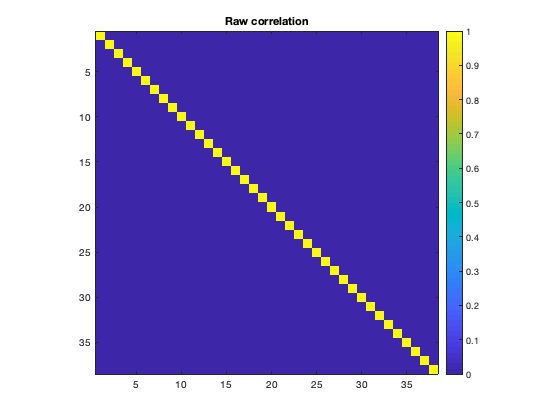
The correlation matrices are produced for each subject, and can be averaged over to obtain group-average connectivity profiles. Due to the orthogonalization, there is no raw correlation between brain regions (as expected). Note that in the second plot, the correlations along the diagonal are suppressed by adding NaNs to improve clarity.
figure
imagesc(mean(d.correlationMats{1}.correlation,3))
axis square
colorbar
title('Raw correlation')

figure
imagesc(mean(d.correlationMats{1}.envCorrelation,3)+diag(nan(38,1)))
axis square
colorbar
title('Envelope correlation')
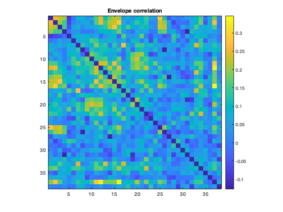
Note that we can see the parcel 37 is the PCC, which shows a lot of connectivity with the rest of the brain. The ability to resolve this connectivity can depend on the parcellation, because the region of interest must be accurately represented. When performing a network analysis, it is not unusual to to test a number of different parcellations to verify how robust the results are.
Colclough et al. (2015) strongly advocates using partial correlations as a measure of connectivity. In that study, it is also shown that estimating direct network connections using partial correlations without regularisation is noisy. A typical ROInets analysis pipeline includes a regularization step. We can plot the connectivity based on partial correlation with and without regularization to see the effect of regularizing
figure
imagesc(mean(d.correlationMats{1}.envPartialCorrelation,3)+diag(nan(38,1)))
axis square
colorbar
title('Envelope partial correlation')

figure
imagesc(mean(d.correlationMats{1}.envPartialCorrelationRegularized,3)+diag(nan(38,1)))
axis square
colorbar
title('Envelope partial correlation (regularized)')
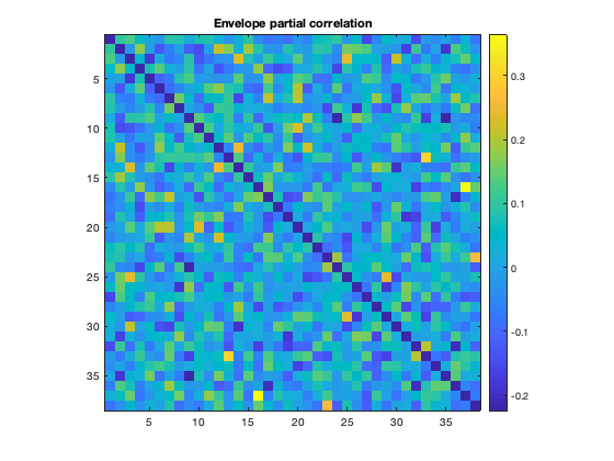
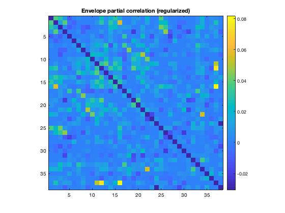
Notice how the regularized matrix is much less noisy, and shows the PCC connectivity much more clearly than without regularization.
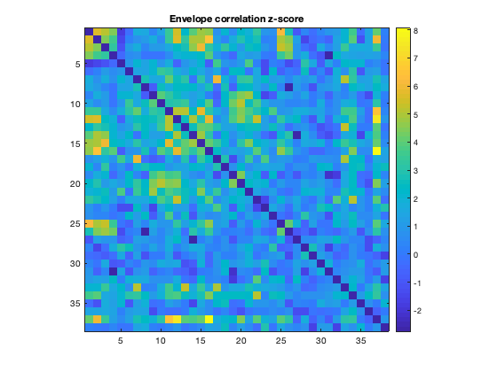
Another important step is to assess the statistical significance of the connectivity provides. This can be tested by using a null model to generate simulated timecourses with some of the same properties (e.g. spectral content) as the original data, but without any real functional connectivity. By repeating this multiple times, a null distribution of connectivity values for each edge can be computed, and this distribution can then be used to convert the real connectivity profile to a Z-score. In ROInets, an autoregressive model is used to generate the null data. ROInets automatically computes and saves a connection matrix with the Z-scores, so we can plot this directly
figure
imagesc(d.correlationMats{1}.groupEnvCorrelation_z+diag(nan(38,1)))
axis square
colorbar
title('Envelope correlation z-score')
Another way to display connectivity is to draw lines between brain regions. As there are a very large number of connections, it can be helpful to threshold the connectivity. The example below loads the parcellation into a Parcellation object (provided by OSL) and uses the plot_network() method to display the strongest 5% of connections
p = parcellation(spatial_basis_file);
[h_patch,h_scatter] = p.plot_network(mean(d.correlationMats{1}.envCorrelation,3),0.95);
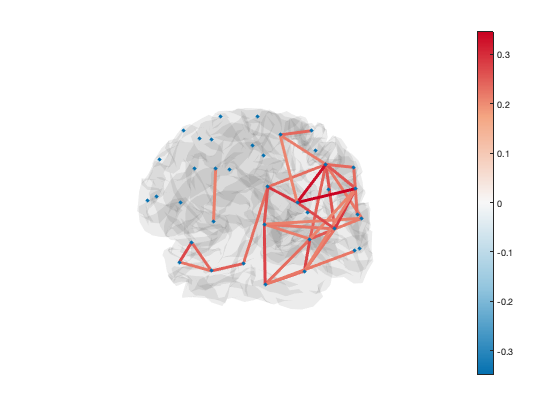
A scatter plot with spherical markers is included to show the brain regions. You can set the size of these markers to a different value with:
set(h_scatter,'SizeData',60)
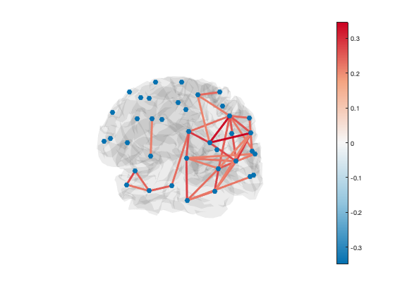
You can also set the size of each marker independently:
set(h_scatter,'SizeData',50*rand(38,1))

The line colours are drawn from the figure colormap. To change the colour scheme, simply adjust the colour range of the plot or change the colormap
set(gca,'CLim',[0.1 0.3])
colormap('jet')
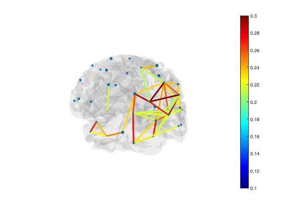
The default colormap is 'bluewhitered' which is single-sided or two-sided depending on the colour limits
colormap(bluewhitered)
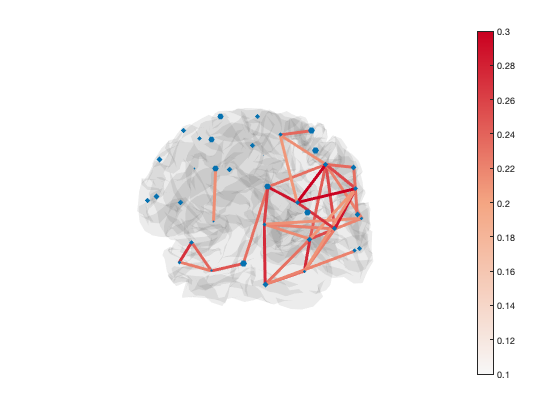
Transparency is used to show or hide connections. Each edge has transparency equal to its percentile. You can adjust the alpha limits to change which connections are visible
set(gca,'ALim',[0 1]) % Show all connections
set(gca,'ALim',[0.9 1]) % Start fading in connections above 90th percentile
set(gca,'ALim',[0.95 0.95+1e-5]) % Hard cutoff at 95th percentile

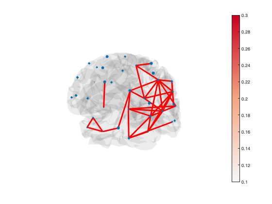
You can manually set the colour of the lines as well, if you want all of the lines to be the same colour
set(h_patch,'EdgeColor','r')
For presenting results, we often show a rotating animation of the network. This can be produced using the osl_spinning_brain() function. Specify an output file name, and a video file with one rotation will be generated. You can then add this file to a presentation, and set it to play automatically and loop playback.
try
    osl_spinning_brain('example.mp4')
catch
    osl_spinning_brain('example.gif')
end

Try opening this video file and setting your video player (e.g. Quicktime) to loop the video.
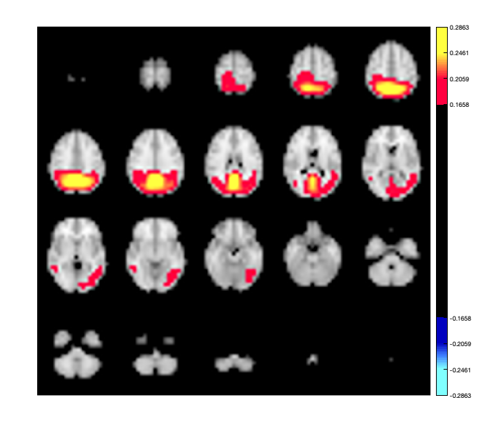
Another option for displaying connectivity is to display components of the connectivity as an activation map. For example, you can perform an eigenvalue decomposition of the connectivity matrix to extract the dominant spatial patterns of activation. Each eigenvector represents a spatial pattern, and the entire connectivity matrix can be written as a sum of these patterns, weighted by the eigenvalue. Thus the eigenvectors associated with the largest eigenvalues correspond to dominant spatial patterns. You can render these on the brain using the Parcellation object.
[a,b] = eig(mean(d.correlationMats{1}.envCorrelation,3));
p.plot_activation(a(:,1));
Warning - parcellation is being binarized
Having computed the individual connection matrices for the entire group, we can now look at some of the group level statistics. For example, we could use a paired t-test to investigate where the connectivity is different between the alpha and beta band
alpha_connectivity = d.correlationMats{1}.envCorrelation;
beta_connectivity = d.correlationMats{2}.envCorrelation;

% Set the dimension to test the same edges across subjects
[sig,p_val] = ttest(alpha_connectivity-beta_connectivity,0,'dim',3);

figure
imagesc(sig)
axis square
colorbar
title('alpha-beta significant differences')
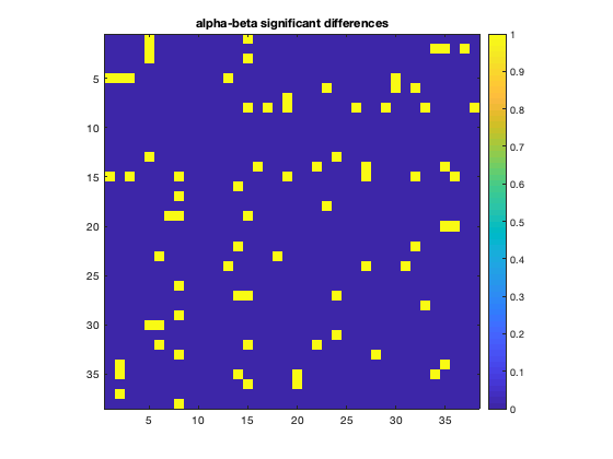
Don't forget to correct for multiple-comparisons! As the size of the data set increases (more subjects, more bands), other approaches for examining group level differences such as permutation testing could be used.
EXERCISES
Try different frequency bands here as well, to see which yield the strongest group effects.